Crafty Corner (aka notes on making merchandise for fairs and conventions)
a spot to note down how I've been making my keychains, prints and cool goodies as of late 2023, and, in this day and age of AI bullshit, keeping 'art secrets' is a load of pompous shite that serves to mystify and seperate ''''art''' from the Actual Fucking Labour artists need to be paid for.
but first, dates for holidays in China, because ordering your convention merchandise durng peak convention season (May to September) means
not only are you taking the pissyou won't see it arrive for months, but also!! your chosen manufacturer will take days off as well. so please plan your orders accordingly:mid-autumn festival - Sep 29 2023
national day of the PRC - Sep 29 to Oct 6 2023
golden week - Oct 1 to Oct 7
new lunar new year 2024 - Feb 9 to Feb 15 2024
qingming festival - Apr 4 2024
labour day - poss May 1 2024
dragon boat festival - Jun 10 to Jun 12 2024
mid-autumn festival - poss Sept 17 2024
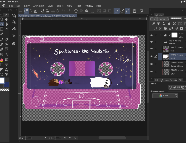
okay, when you got those jotted down, i can start doing these notes. i am using the iPad version of Clip Studio, which is almost identical to the Desktop version. i use both versions but my iPad is my current workhorse
editing art for print because it prints out too dark and muddy, part 1: finding and using CMYK View in Clip Studio Paint
for when you're already doing 90% of your art in good old Clip, but it exports in favour of RGB files which is NOT the same as converting them into CMYK. i will explain how to Very Prepare your files for CMYK print in part 2 - practicals first, theory second
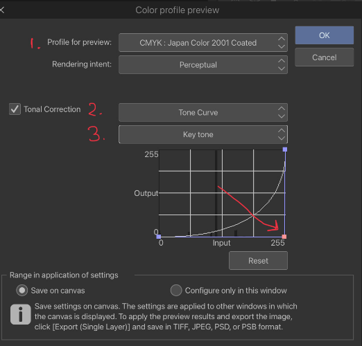
- CMYK:Japan Color Coated 2001
- then switch on Tonal Correction
- then on the dropdown pick Key Tone
- click and pull the middle of the graph line all the way down to the bottom right corner
what does this do? this gets you out of RGB (screen colour) view and into CMYK (print colour) view. the graph line that was edited earlier cancels out the amount of K that will appear on your screen. if you want to see the difference, follow the previous steps and tug it back up again.
see that mucky tone? that is what happens when your CMYK printer tries to compensate for the darker areas in your RGB digital file - it's the black cartridge (Key Tone, the 'K') blasting out way too much for darker shades in your art.
Clip will use CMYK view to show you a composite print view of how the final image will look. It's not as fruity and fun as RGB but understanding how your printer uses ink will spare a lot of heartache.
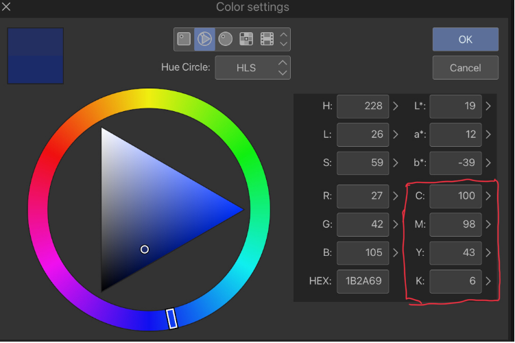
keeping an eye on this section on the Colour Picker will also help. this is how we interpret the information:
- Cyan (the blue C ink) is at 100%, because we are picking a shade of blue.
- Magenta (the pink M ink) is at 98%, is mixed in to make the blue warmer.
- Yellow (the untransfigured!! primary colour) is at 48%, because any more would turn our blue closer to green.
- Black (K) is at 6%, which isn't enough to muddy this blue, but any higher will... muddy this blue.
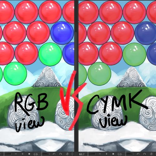
the CMYK example on the right is unedited, other than changing the colour profile. note how dimmer the blue and green bubbles are at this stage. this must be the work of an enemy stand!? is how K appears.
editing art for print because it prints out too dark and muddy, part 2: fixing that shit in Photoshop, or another Not Adobe eqivalent because they suck
when your art is done and you're dreading muddy colours. well done, you've made it this far.
Step 1: open your dang file, first of all. there's a couple of settings you might need to tinker with in PS first.
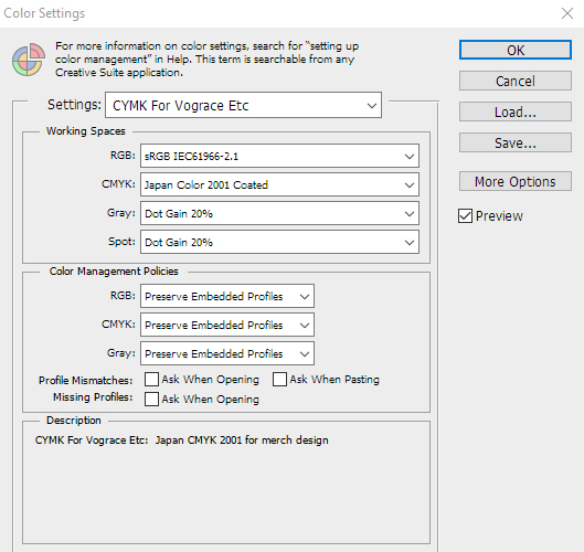
Step 2: Edit -> Color Settings. pick Japan Color 2001 Coated from the CYMK dropdown. make a save of your settings and give it a name. easy peasy
Step 3: now we get to fuckin work. Image -> Mode -> CMYK Color -> Don't Merge Layers, because we can still do things with them -> whammmo. Save this as a new file if you don't have a habit of this already
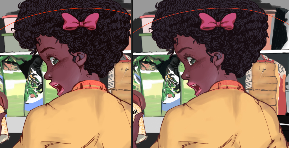
RGB on left, CMYK on right.
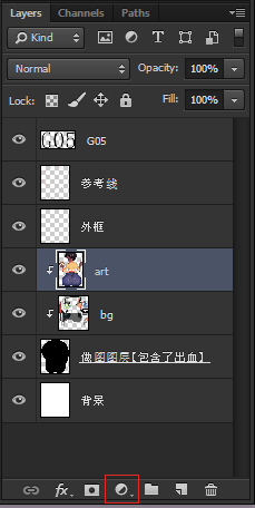
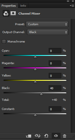
Step 4: at the bottom of your Layers window, we need to find this half and half looking button here. click it and choose Channel Mixer. a new adjustment layer will appear, with a Properties window popping up. pick Black from the Output Channel Dropdown and dial that sucker down. the lower it's turned down, the less K amount will appear in your image. if you want 0% K, do it all here.
the colours may look sparse on your screen, but they will be MUCH brighter when printed. trust the process /shot
Step 5: merge your Channel Mixer layer to your art layer(s), tidy up your work file for the manufacturer (delete unused layers, merge art layers, keep masking layers seperate...), and export it to PSD or PDF or whatever you need to send off. DONE